With some of the most notable members of the Israeli parliament’s history, Meretz wasn’t the biggest political party, but it definitely was always noticeable and had a huge impact on the country’s political discourse. Israel’s fifth elections in a row created a double challenge; first, to keep potential voters (who were discouraged and tired by that point in time) engaged, and second, to embrace the party’s new position as a member of the previous government. All of that in a contemporary manner which is suitable for a mostly digital campaign, but without losing Meretz’s legacy of over 30 years.
Our solution was as simple as it was impactful, and above all – extremely symbolic; Meretz was always synonymous with its green logo and branding, we took that colour palette and almost inverted it completely. The green (who was also updated into a more digitised tone) went from being the primary colour to a secondary colour, highlighted and brought deep blue backgrounds to life. Implying that Meretz’s green was and should be that spark of colour that highlights and promotes important issues from within the government’s deep “Israeli” blue
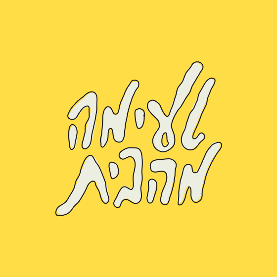
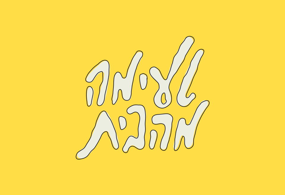
Another key element of the new visual identity was the doodle – freestyle unpolished lines, that be also used as a graphic/typographic element that reacts to text and imagery. The manual free-styled doodles were meant to stir things up and bring a contemporary edge to political graphic design.
.The small scale turmoil it caused on social media at the time proved it really was quite different than what we were all used to see in those campaign back then – but the fact that even President Biden used similar doodles in his campaign six months later might suggests that things are indeed changing.

Israel’s fifth elections in a row created a double challenge; first, to keep potential voters, and second, to embrace the party’s new position as a member of the previous government
The green (who was also updated into a more digitised tone) went from being the primary colour to a secondary colour, highlighted and brought deep blue backgrounds to life.


Another key element of the new visual identity was the doodle – freestyle unpolished lines, that be also used as a graphic/typographic element that reacts to text and imagery.


הגישה הידנית והחופשית נוצרה מתוך הצורך לעשות דברים אחרת ולחדש בתחום העיצוב הפוליטי


