Extensive research that included a historical review, going through contemporary media, tours, and interviews, led to the conclusion that Bialik square is best described as a “space” of Tel Avivian culture. As opposed to a planned, engineered “compound” that has clear physical boundaries, or the somewhat outdated “centre”.
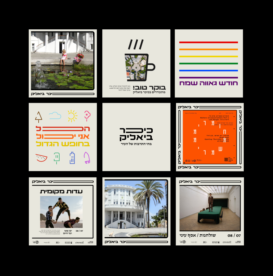
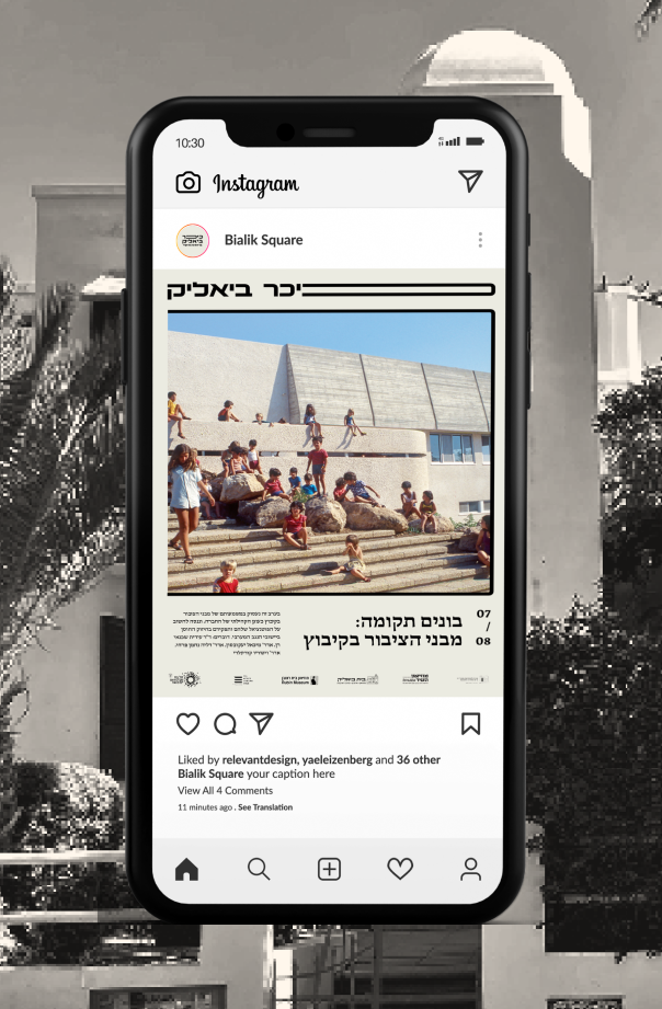
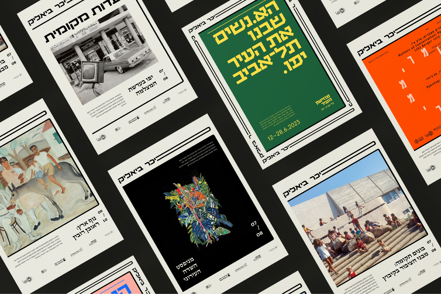
The word “space” fits for a characterised area, that has an identity but doesn’t have borders. Bialik square’s cultural space consists of five Tel Avivian cultural institutes, each has a rich history and an impressive scope of activity nowadays. While building the brand’s identity, we found there are threads of local Tel Avivian identity, past and present, that was formed right here around Bialik square over the years. This is why we have decided to create a brand the revolves around the idea of containment – containing (a variety of contents) rather than restricting it. The graphic language was designed to look straightforward, and allow the content the cultural institutes themselves produce take the main-stage.
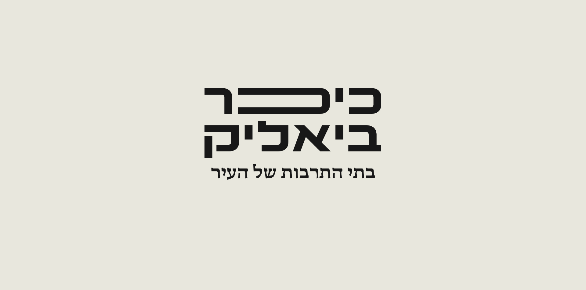
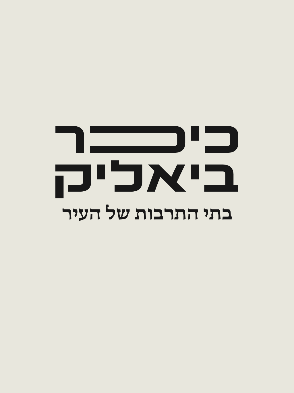
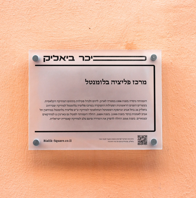
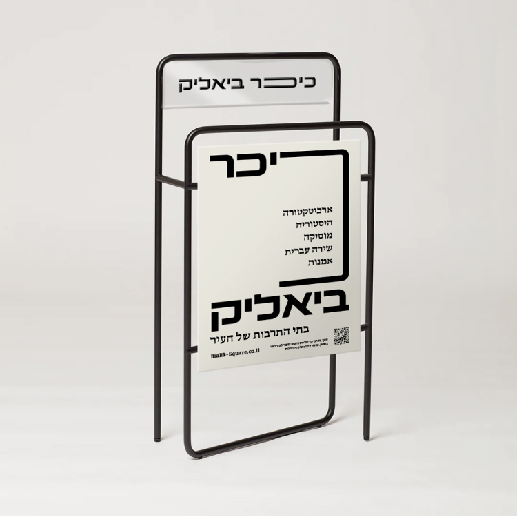
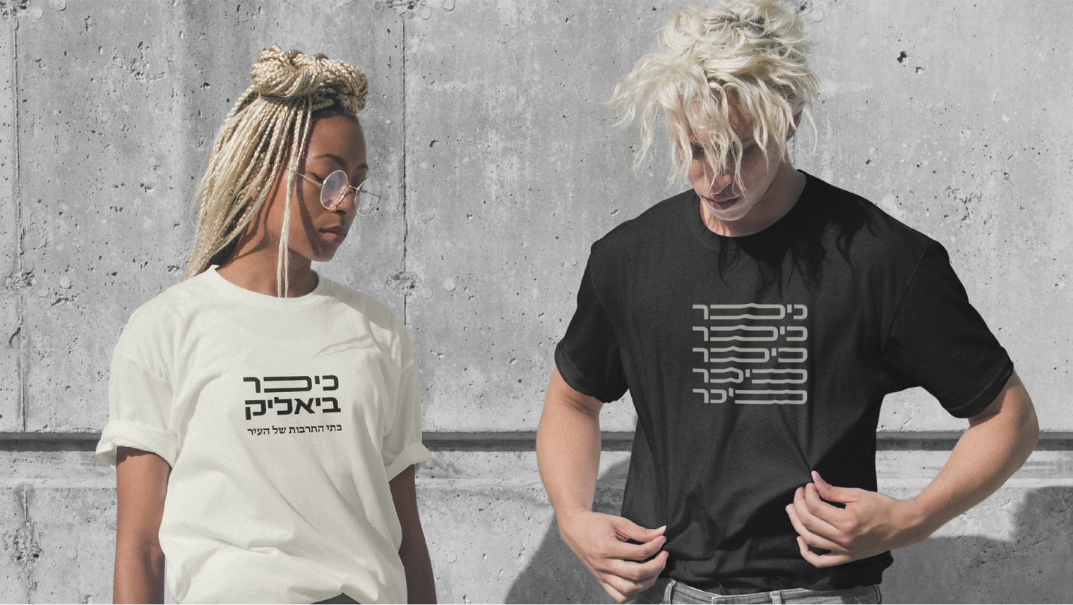
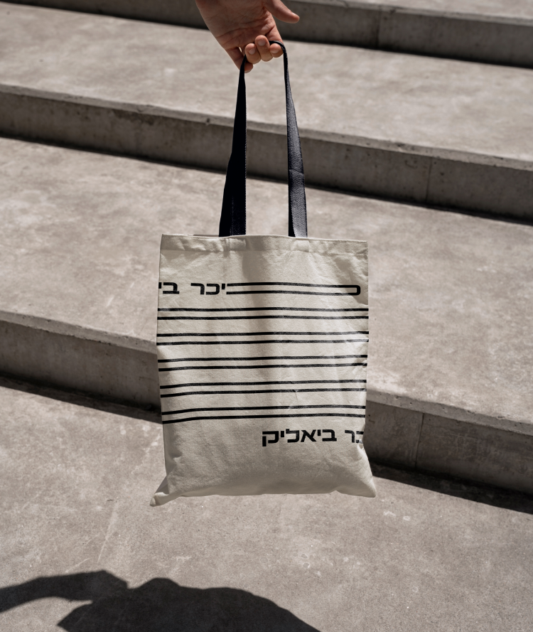
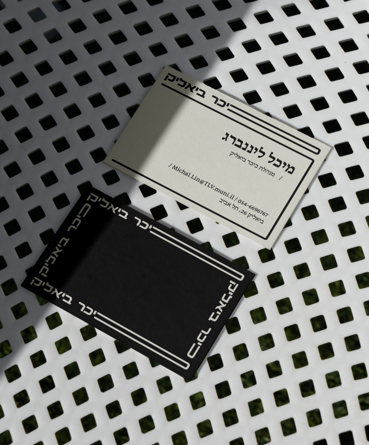
The graphics are based on the usage of the letter Khaf as a dynamic open container, and on traditional Hebrew typographic playfulness of extension of certain letters. The system of container Khafs is also used a the basis of iconic and illustrative language that follows the same rule of the dynamic uniform line thickness linear style, as our headline font.
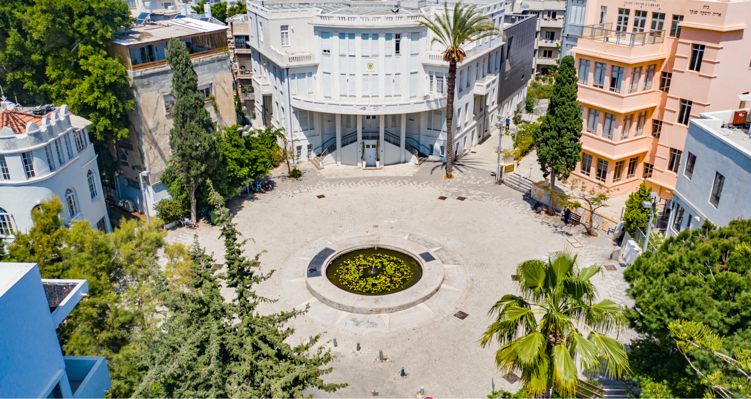
Bialik square is best described as a “space” of Tel Avivian culture. As opposed to a planned, engineered “compound” that has clear physical boundaries, or the somewhat outdated “centre”

The graphics are based on the usage of the letter Khaf as a dynamic open container, and on traditional Hebrew typographic playfulness of extension of certain letters
While building the brand’s identity, we found there are threads of local Tel Avivian identity, past and present, that was formed right here around Bialik square over the years
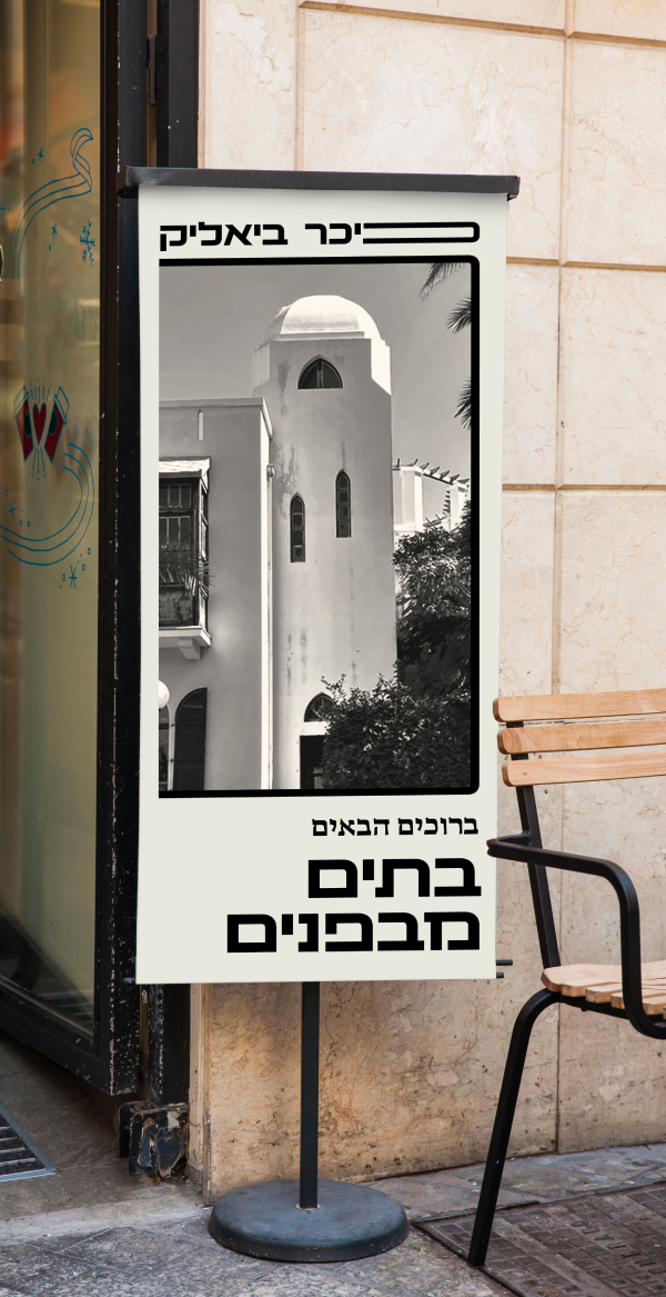
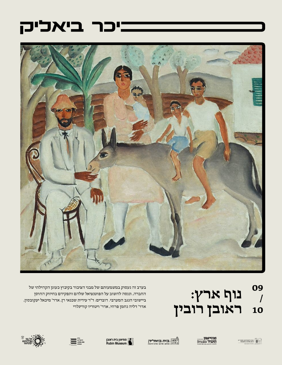
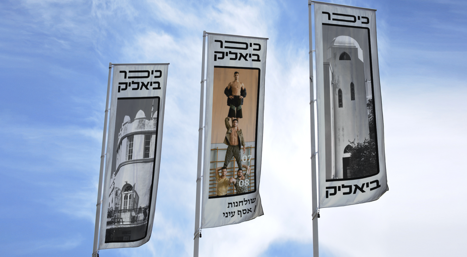

Hebrew typographic playfulness of extension of certain letters. The system of container Khafs is also used a the basis of iconic and illustrative language that follows the same rule of the dynamic uniform line thickness linear style, as our headline font
This is why we have decided to create a brand the revolves around the idea of containment – containing (a variety of contents) rather than restricting it. The graphic language was designed to look straightforward, and allow the content the cultural institutes themselves produce take the main-stage.