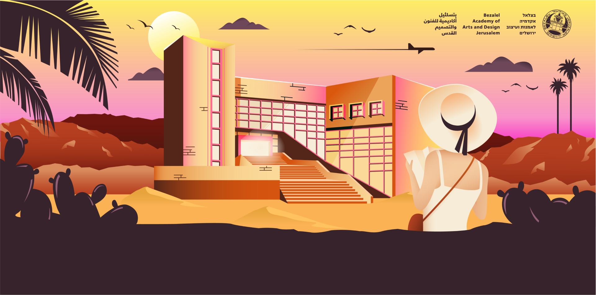
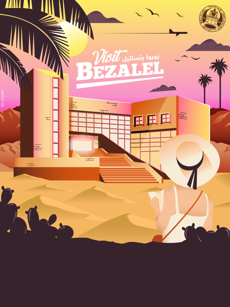
Designing Bezalel’s graduates exhibition always starts with a basic Venn diagram – there are three overlapping subjects: Bezalel, the graduates, and the year in which they graduate. In 2018 the diagram gave birth to a new concept – “Visit The State of Bezalel”.
It was a combo of different themes that added up: the public discourse about how the academy separates itself from the rest of the country, the fact that the exhibition takes place in the middle of summer when many people have traveling on their minds, and even an old tourism poster by designer Ze’ev Rabban that included a recommendation to visit Bezalel.
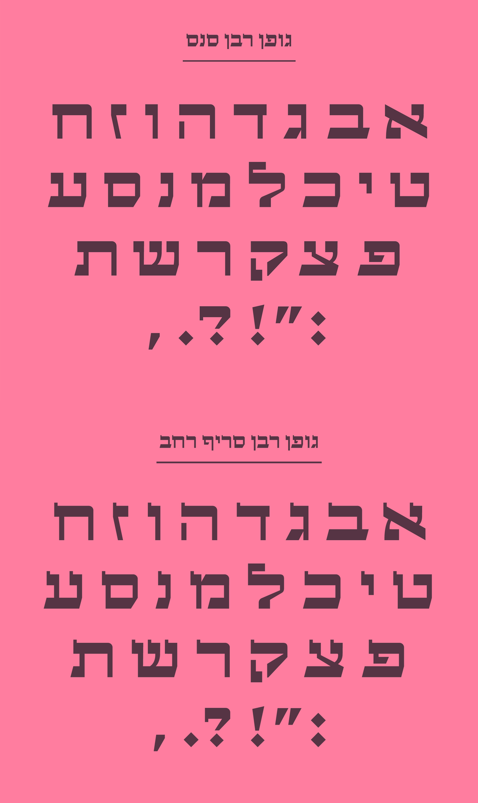
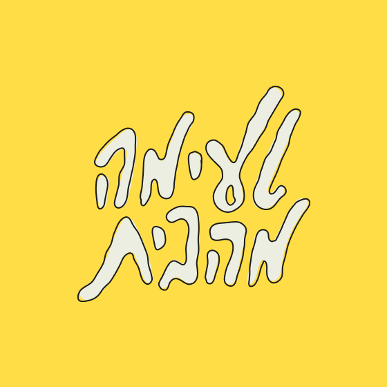
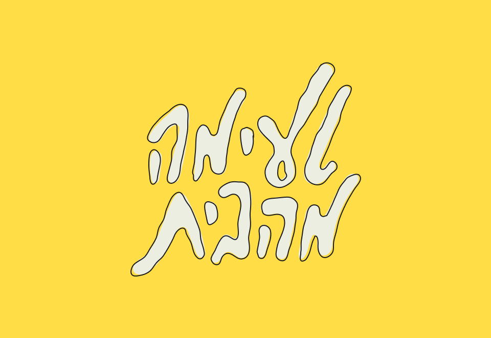
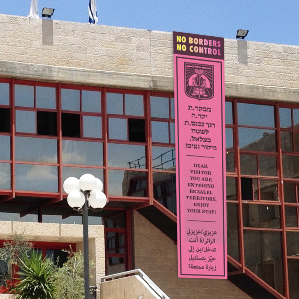
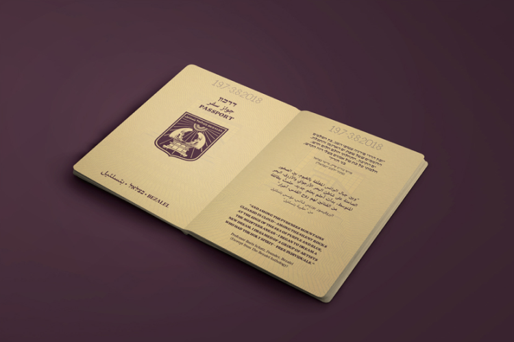
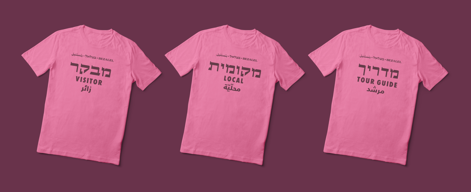
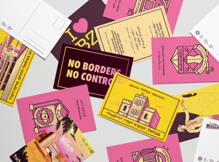
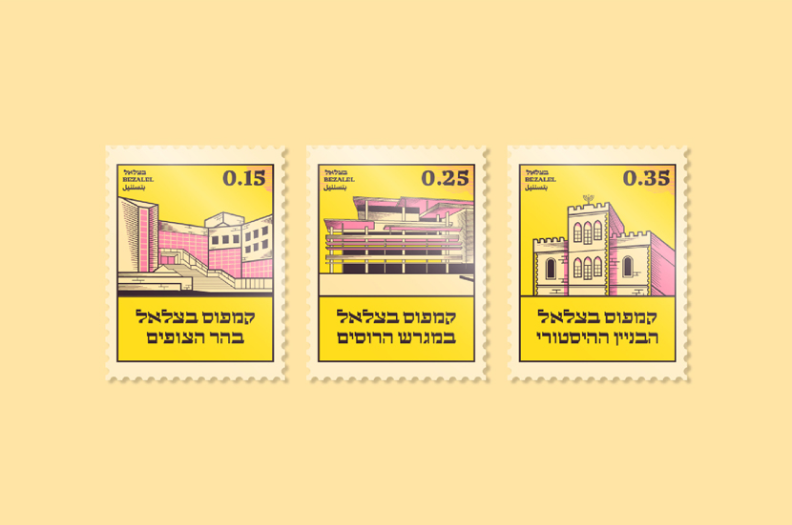
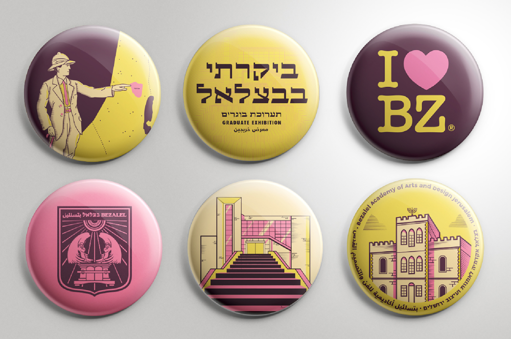
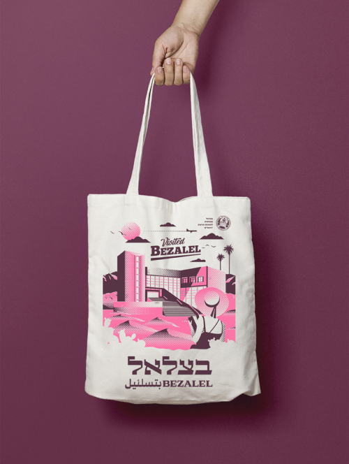
For that purpose we have created all kinds of applications that are quoting and inspired by familiar objects of international travel; passports, flags, posters, and so on. Ze’ev Rabban’s poster included retro looking lettering that inspired us to create a whole typeface, which we used also for the exhibition’s logo and also as a headline font.
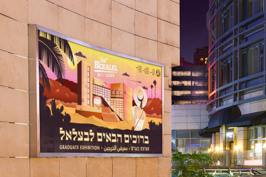
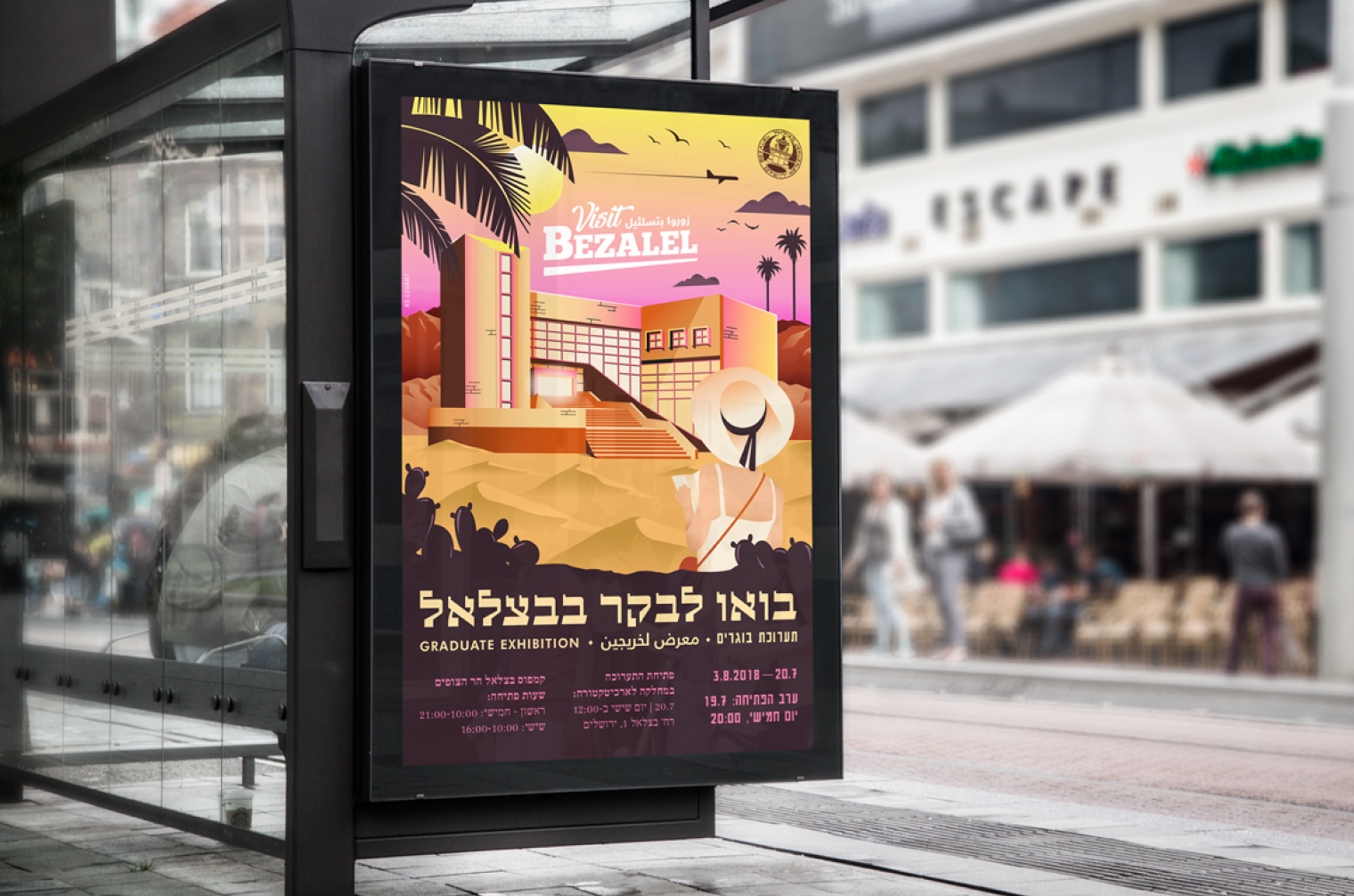
– There are three overlapping subjects: Bezalel, the graduates, and the year in which they graduate. In 2018 the diagram gave birth to a new concept – “Visit The State of Bezalel”
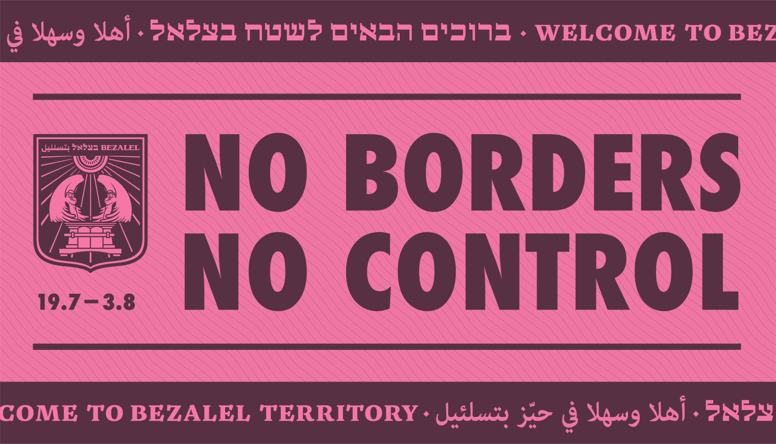
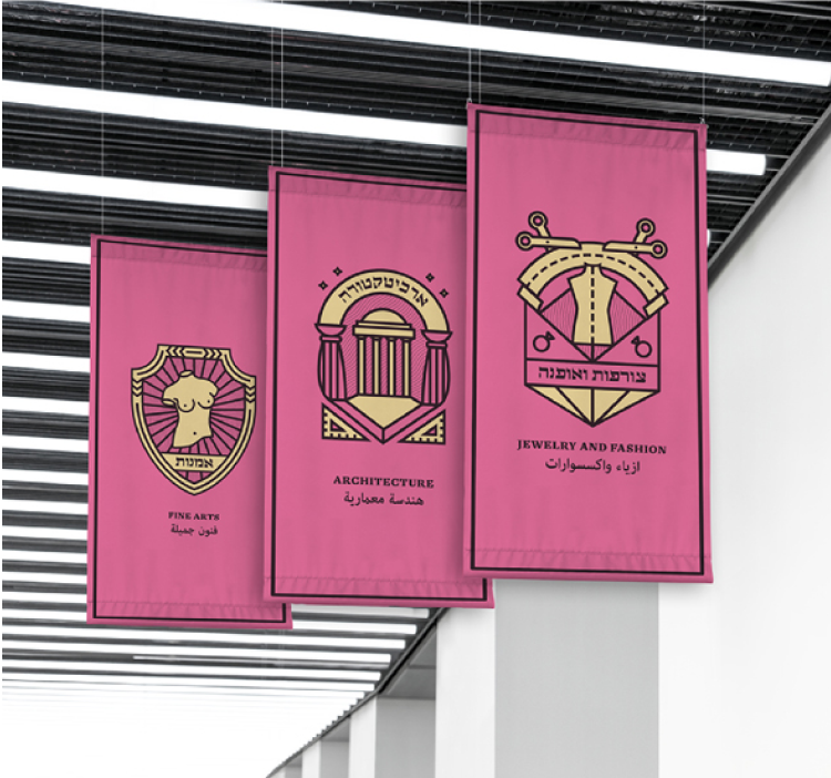
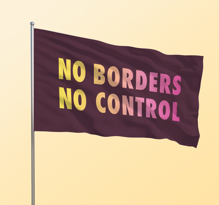
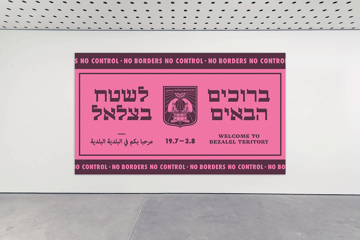
For that purpose we have created all kinds of applications that are quoting and inspired by familiar objects of international travel; passports, flags, posters, and so on
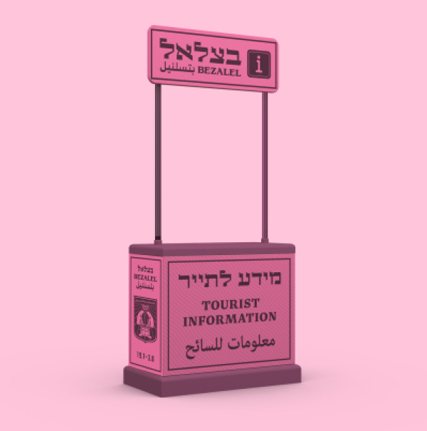
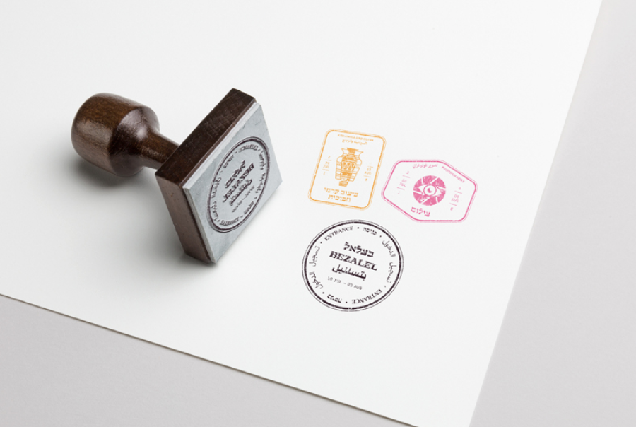
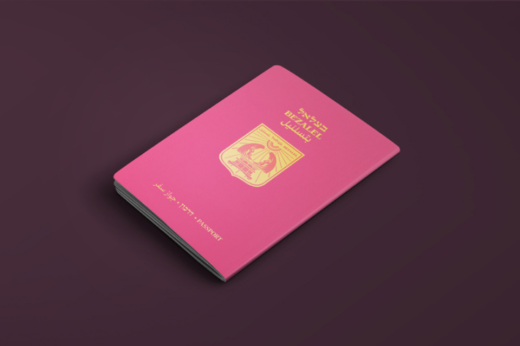
The fact that the exhibition takes place in the middle of summer when many people have traveling on their minds
Ze’ev Rabban’s poster included retro looking lettering that inspired us to create a whole typeface
