Blooma is a boutique brand of aromatic English gin, produced in the UK in four different versions, with four different floral blends – all endemic to the British Isles. The company was named after Margaret Bloom, the founder’s grandmother, and is a tribute both to the obligatory family name (Bloom = blossom) and to Margaret’s love of gardening.
In the endless list of distilleries that speak masculinity and tradition, we found that Blooma has an almost pristine segment to create in, and that’s why every element of the brand’s graphic identity echoes one of its two core values: femininity and contemporary. The floral blends got a contemporary form of visualisation with blow-ups of 3D images of flowers. The 3D technique allowed us to create flowers that are almost earthly, but at the same time – fantastic.
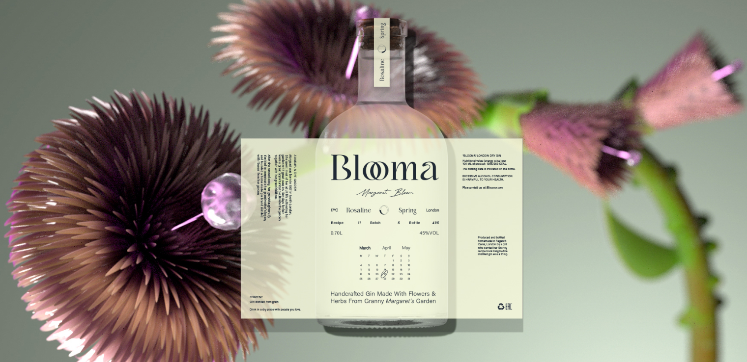
The logo is a logotype made with an Ar-Nouveau-like, rounded font. The two O’s are connected to form a ligature, which can also be used as a monogram version of the logo. Each blend symbolises a different season of the year, and on each label there is a marking of the date on which the gin was distilled, marked and signed in a handwriting that simulates Margaret’s handwriting.


he floral blends got a contemporary form of visualisation with blow-ups of 3D images of flowers. The 3D technique allowed us to create flowers that are almost earthly, but at the same time – fantastic.