The Miznon (Hebrew for “diner”) font was inspired by the first cooking book that was printed in Hebrew in Israel back in 1936.
The Miznon is a modernised version of square shaped Ashkenazi typefaces – with relatively thick vertical lines and thick horizontals the letter gets a very square-like stable look.
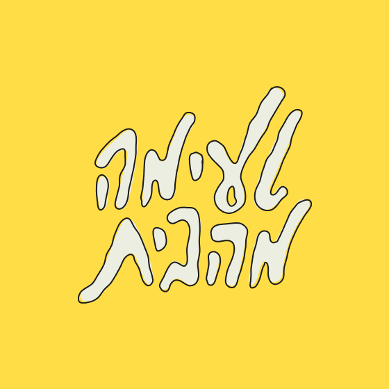
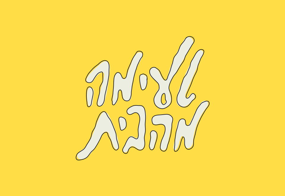
The font has small straight serifs, almost like in old classic Roman fonts. We have launched the Miznon with a series of illustrated Hebrew take-offs (both in illustration and in naming) to popular international brands.


The Miznon is a modernised version of square shaped Ashkenazi typefaces – with relatively thick vertical lines and thick horizontals the letter gets a very square-like stable look.


