The Tel Aviv City Museum is not a historical museum, nor an art museum, it is a museum that expresses the human and cultural mosaic that makes Tel Aviv what it is, through the stories and memories of its people – whether it’s a private love story that was born on a bench in the Hatikva neighborhood, or whether it is the inspiration A Tel Avivian artist got for her creation in Gordon Beach.
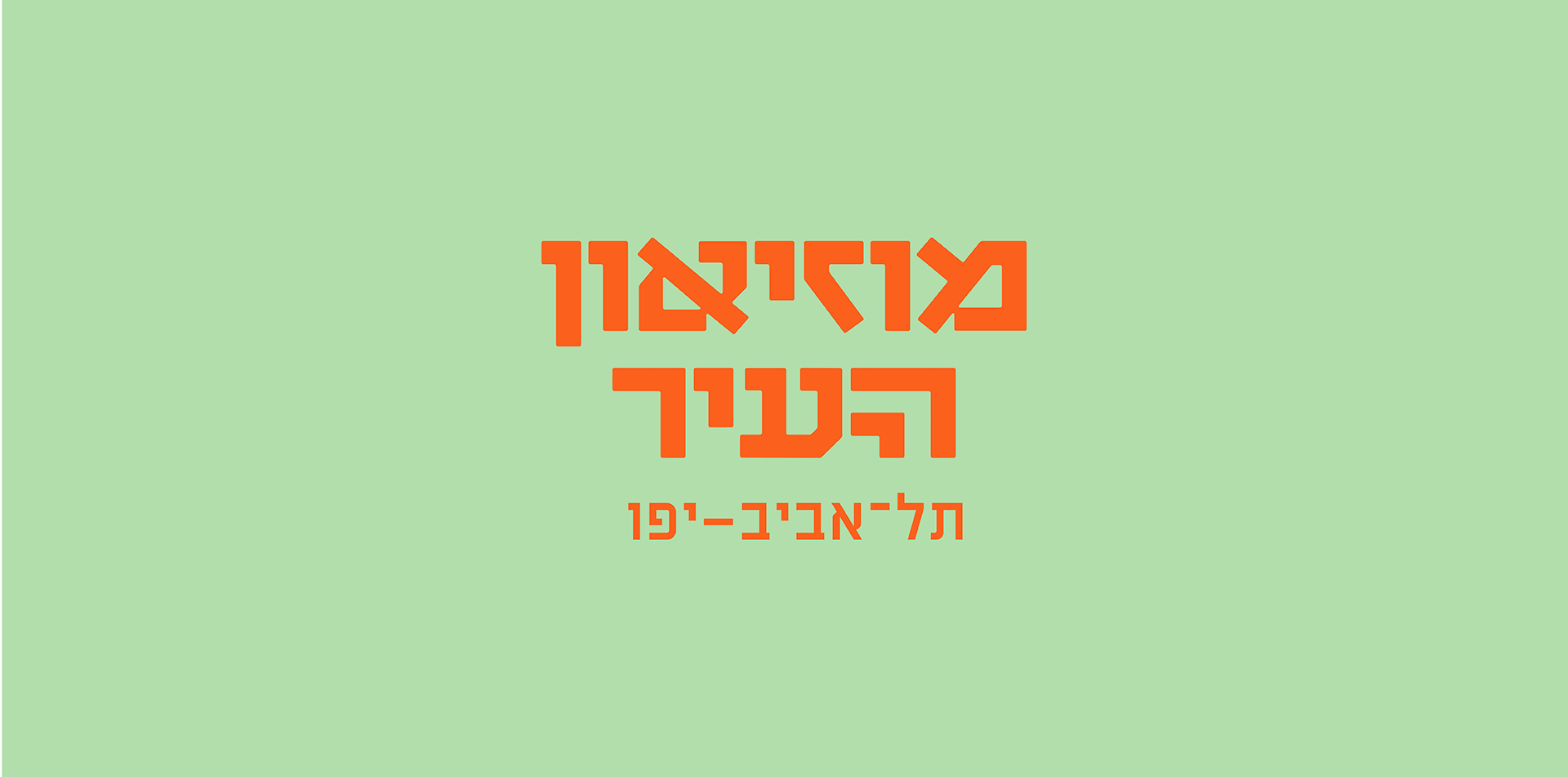
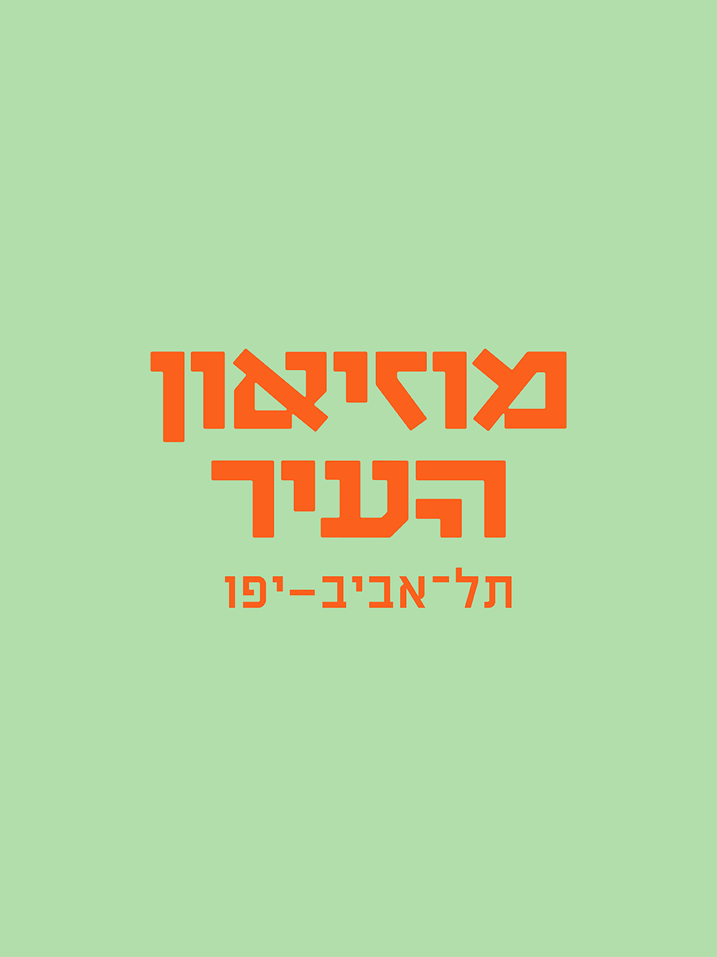
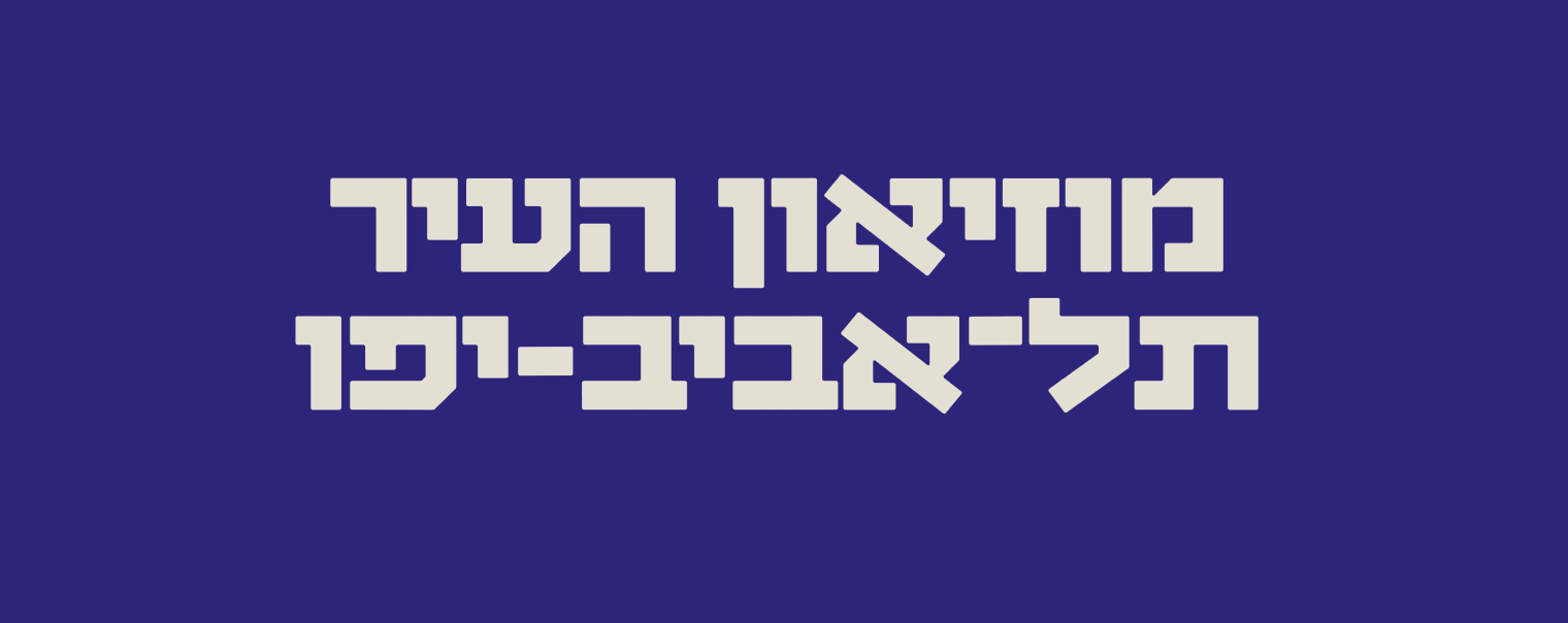
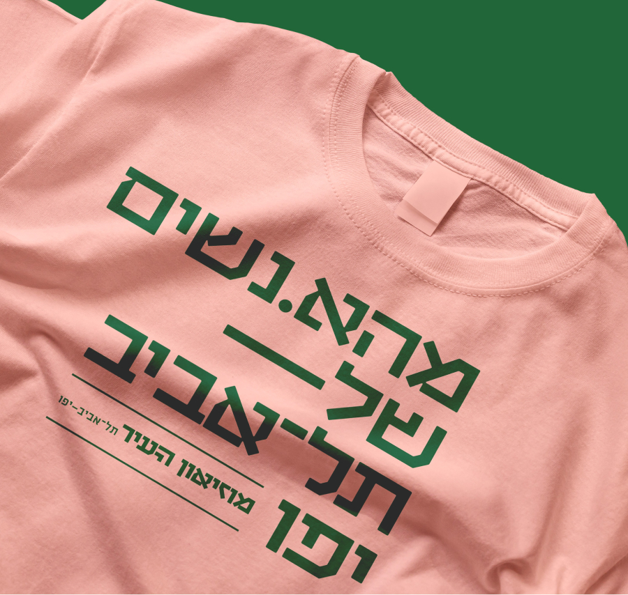
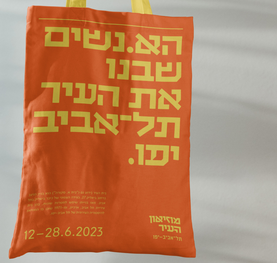
The logo we created is a logotype inspired by the font of one of the old sketches to the original city symbol. We took the same letters that appear in the sketch, and created a complete headline Hebrew font. Later, we created another, slightly more daring version of it – one which also includes some surprising angles that challenges the modernist type tradition – and this is how the “Tel Aviv” font was created. Neo-modernist and presentable, stable, self-confident, direct, but also soft and knows how to match all colors – or in other words – a Tel Avivian font.
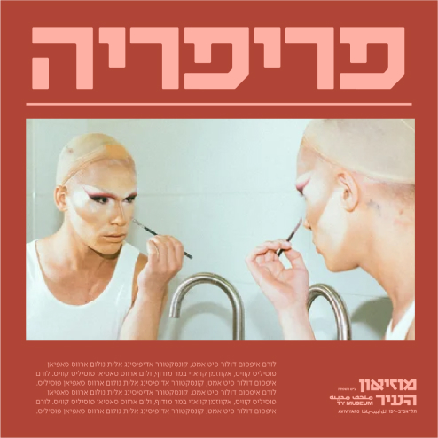
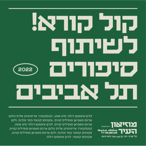
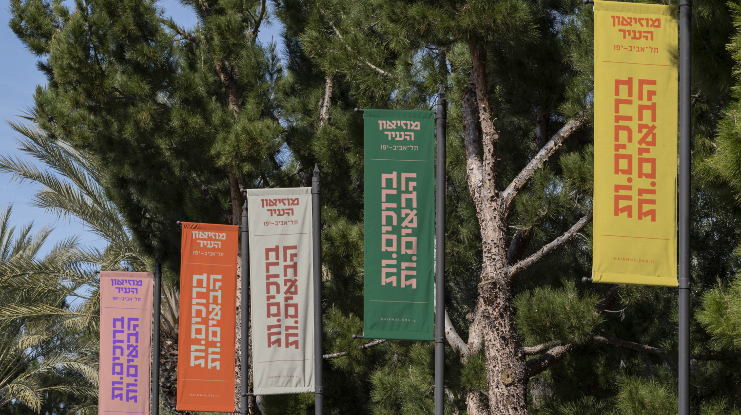
The graphic language is based on a large presence of the Tel Aviv font and on bold color combinations. The very fact that the font is fondamentally made to express different contents, together with the versatile use of color pairing, expresses the museum’s identity, and to a large extent also the city’s identity. The bold typography is balanced by the hierarchical gap between the big headlines and small body texts, and the sparing use of thin lines. The photographic language in the museum’s internal publications is also monochromatic and stems from the brand’s general color combos.
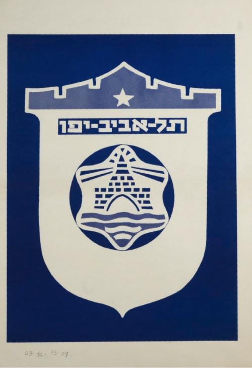

The logo we created is a logotype inspired by the font of one of the old sketches to the original city symbol
We took the same letters that appear in the sketch, and created a complete headline Hebrew font

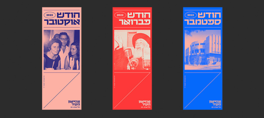
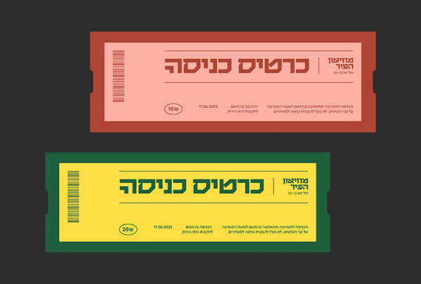
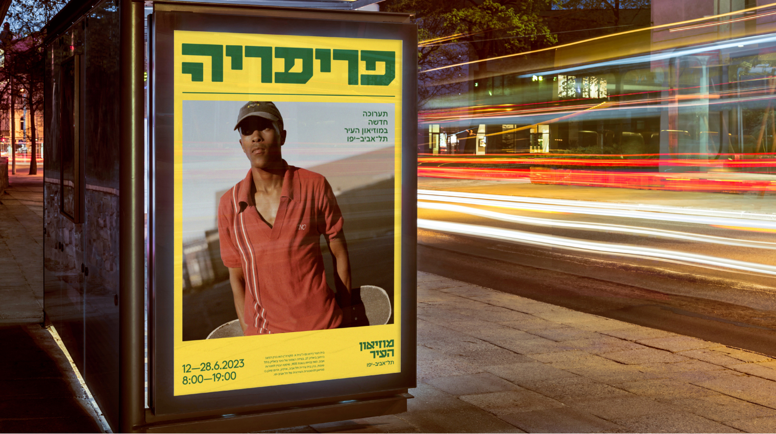
The graphic language is based on a large presence of the Tel Aviv font and on bold color combinations

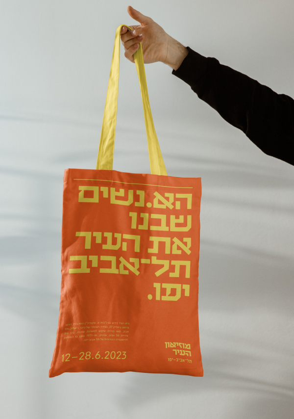
The bold typography is balanced by the hierarchical gap between the big headlines and small body texts