GTH runs and manages different international hotel and hospitality chains. It is a B2B (business to business) enterprise by definition, but one that happens to work in lifestyle related services – and as such it aims to communicate a certain level of elegance and professionalism, as well as fierce contemporary energy.
In order to create this unusual combo, which we have named “Elegance with a kick”, we decided to use a relatively small set of graphic decisions – but one where every decision has a significant presence; Bold heavy typography with freestyle handwritings, simple geometric shapes, and a bold colour scheme.
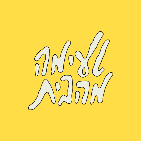
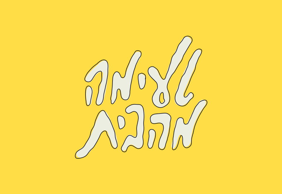
The tension between to heavy headline font to the freestyle handwriting is seen in the brand’s new logo, but also in a surprisingly widely used creative copywriting which is present all across the brand’s different applications. Another key component in the visual langauge is the use of colour blocking, dividing different formats into colourful compositions who bring out their otherwise hidden grids.
It is a B2B (business to business) enterprise by definition, but one that happens to work in lifestyle related services – and as such it aims to communicate a certain level of elegance and professionalism
We decided to use a relatively small set of graphic decisions – but one where every decision has a significant presence; Bold heavy typography with freestyle handwritings, simple geometric shapes, and a bold colour scheme.
Another key component in the visual langauge is the use of colour blocking, dividing different formats into colourful compositions who bring out their otherwise hidden grids.
